Design Projects


Product Design - Samples
The most challenging aspect of these school projects was meeting the specific requirements I was given.
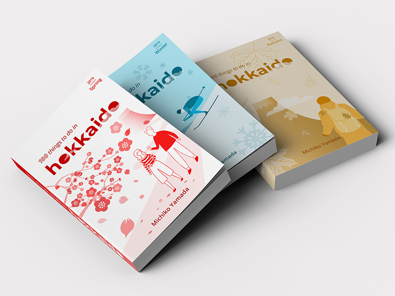
For the book cover set, I used a triadic color scheme for the first cover, and a monochromatic color scheme for each subsequent cover. To add interaction and a sense of movement, I included flower petals, snowflakes, and falling leaves. As a requirement, I needed to create an illustration that conveyed conceptual unity across the set. To achieve this, I included the mountain Ezo-fuji, which represents Hokkaido (previously called Ezo).
Designing the record album cover was enjoyable. I chose to feature my favorite Japanese band, One Ok Rock, and used a large, bold sans-serif typeface that I embossed for emphasis. Deciding where to place the title was a challenge, but I eventually chose a thin script typeface that added emphasis despite its light font weight.
School: New York Institute of Art and Design
Skills: Adobe Illustrator and Photoshop