Design Project #2


Social Media Ads - Samples
Note: Please note that the American Airlines and Target campaigns mentioned here are fictional and not affiliated with the Olympics.
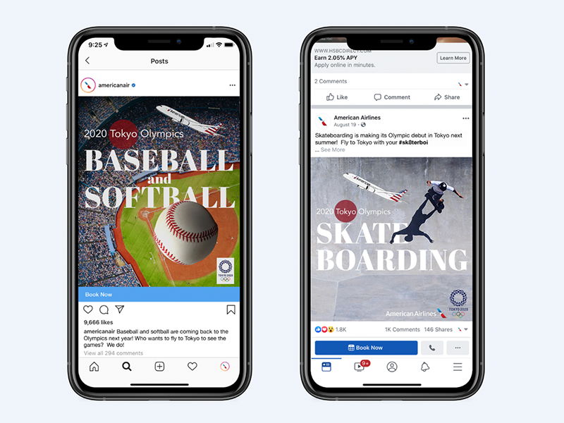
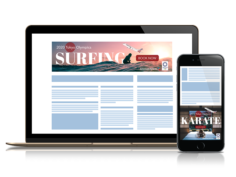
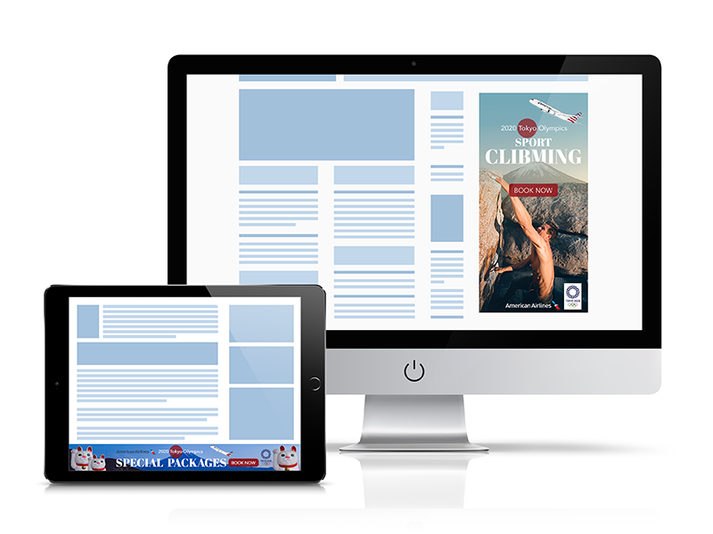
I found this project challenging due to the various specifications that needed to be taken into consideration when creating digital marketing content. I researched these specifications thoroughly before starting the project, and ensured visual hierarchy by using a bold sans-serif typeface and a light sans-serif. Additionally, a red circle was placed behind the word "Tokyo" in all ads, symbolizing Japan.
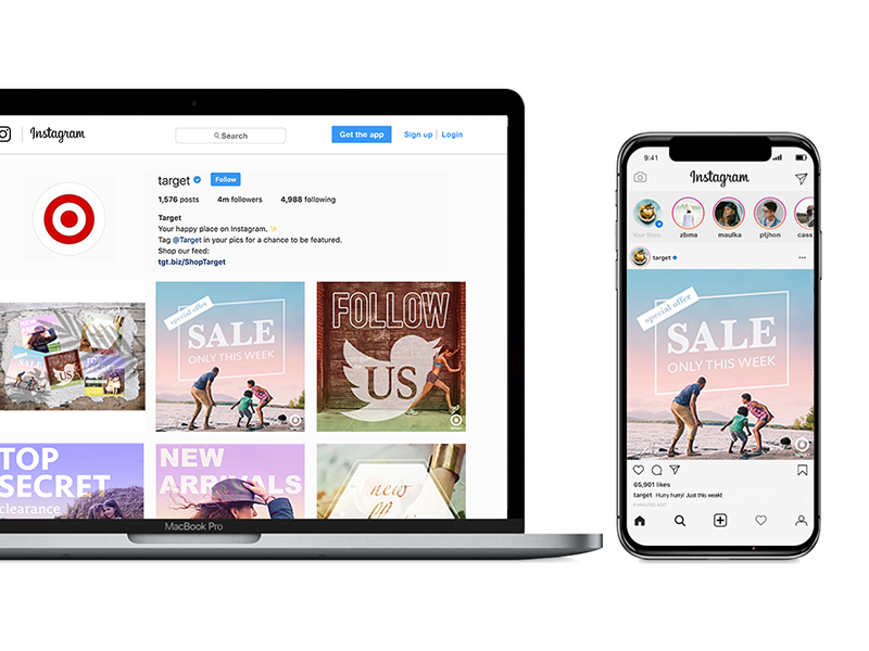
For the fictional Target social media ads, I had to work with pre-existing images and templates. To maintain consistency in the visual style across all ads, I learned how to create transparent text. I then applied a gradient map adjustment layer to tone down each image. In line with the requirement of using a different complementary color scheme, using color gradients helped me maintain consistency.
School: New York Institute of Art and Design
Skills: Photoshop